

THE BIRTH OF THE BOLT
WRITTEN BY KEVIN MEAD | OWNER & EXECUTIVE PRODUCER
We’ve seen our fair share of client rebrands, but even agencies evolve over time! The look and feel of the Nor’easter brand has certainly evolved over our 7 years of service. Each shift signifies a unique stage in our journey, and today, we'll take a look back at each one.
HUMBLE BEGINNINGS
I get asked all the time, “how did you land on the name Nor’easter Digital?” The answer is two-fold:
I lived in Boston from 2017 to 2021, and that first winter was particularly brutal. Sub-zero temperatures hounded the city for weeks, and it seemed that every weekend in early 2018 brought its own nor’easter. I have many fond memories of that first winter in the city, and when I branched out on my own in 2019, I wanted a name that made me smile and think of Boston. “Nor’easter” was at the top of the list.
Fate seemed to make its preference known when we adopted our cat, Moby. Moby is a tuxedo cat who came to us in the Fall of 2019, right as I was setting up an LLC for the business. As you can see from the image, she has a lightning-bolt shaped strip of fur connecting her chin to her belly. It also looks like a giant “N.”
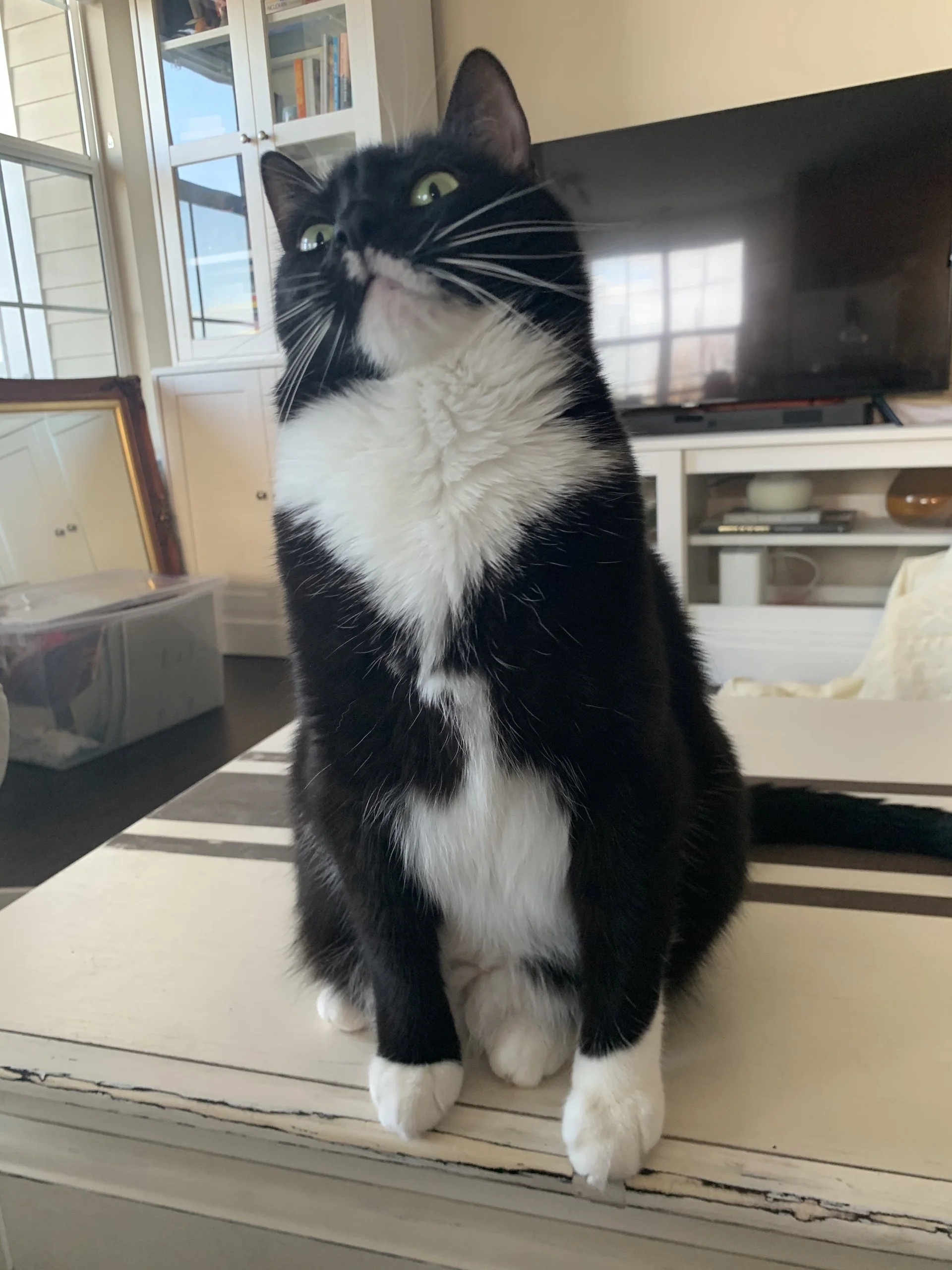
Moby, our unofficial mascot and VP of Nibbling Cords, shows off her lightning bolt pattern in Annapolis, MD.
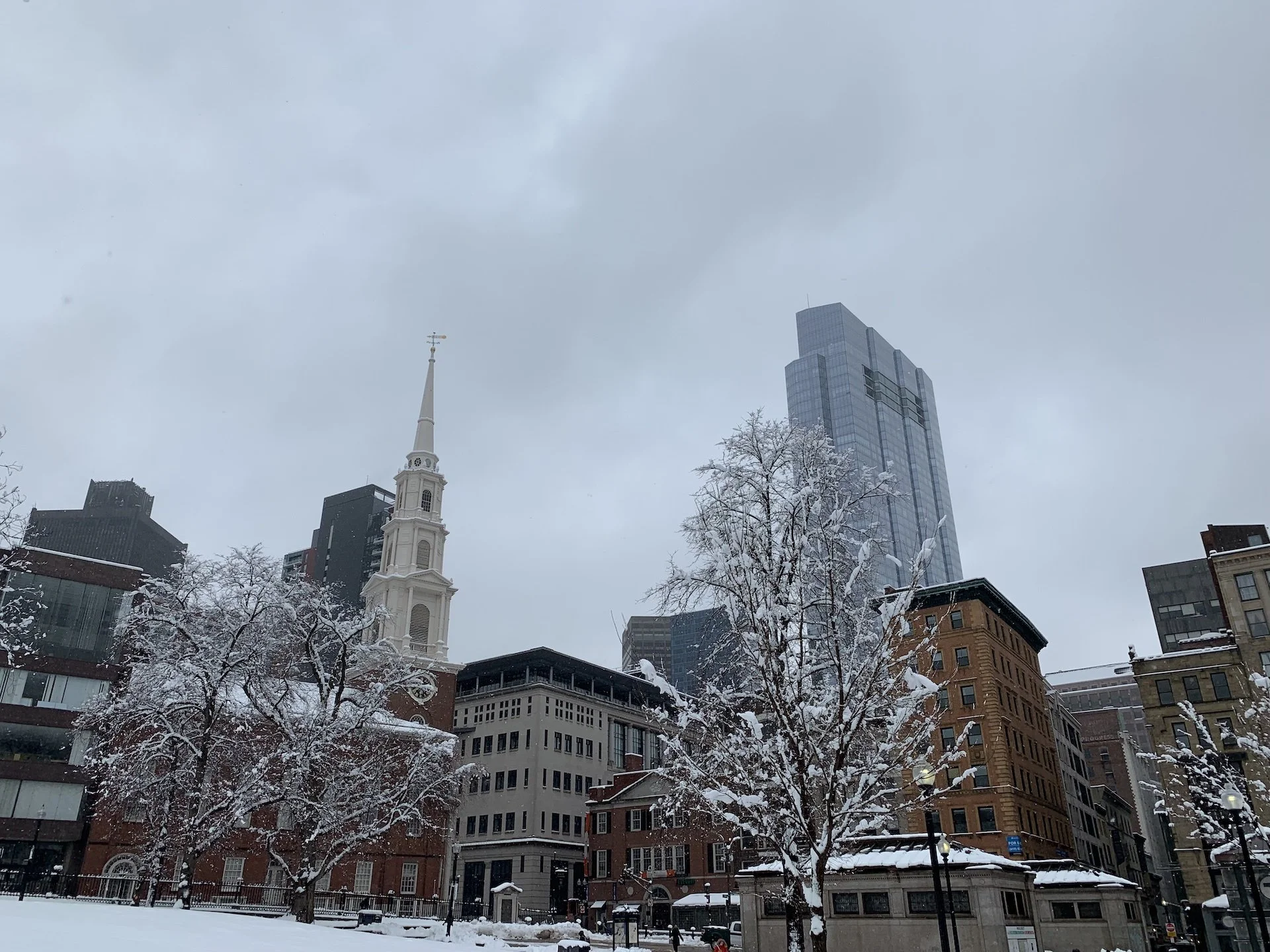
Another snowy day in 2018 Boston
The early Nor’easter brand used that Moby-inspired mark in the logo and brand collateral. It was short, sweet, and not that great (no offense to Moby). But it did the trick for business cards, our website, and other assets as our little studio began to take shape.
The original Nor’easter logo, complete with Moby inspired
MIDDLE YEARS
In 2021, my wife and I moved back down to Maryland. The COVID era was exiting its peak, and the world seemed to be getting back on its feet. We were feeling optimistic for the first time in a while, and it granted me a new vantage point upon which to review the Nor’easter brand. Our original brand was dark, grey, and frankly a little drab, so I knew I wanted to infuse some color into the picture. I didn’t know how much until April of 2021.
It’s funny how much our taste in music can influence our creative preferences. One of my favorite bands, Royal Blood, released an album at the end of April. Whether you’re into rock or not, the album’s artwork and lyrics seemed to capture the optimism that we were feeling too. Bright pinks and blues and chopping guitar riffs brought a unique energy to the album, and it was something I wanted to reflect in our work too.
Music video for “Typhoons” by Royal Blood
We updated to a bolder font treatment and started to infuse color across our site and collateral. We kept the bolt motif, but let it serve as the apostrophe for the logo. We even created a hand-drawn animated bumper video to introduce the brand and pair with our work. This refresh captured the feeling of the team very well that year. Bright, excited for what was next, and eager to put darker days behind. But alas, it was still not quite there…
Animated brand bumper
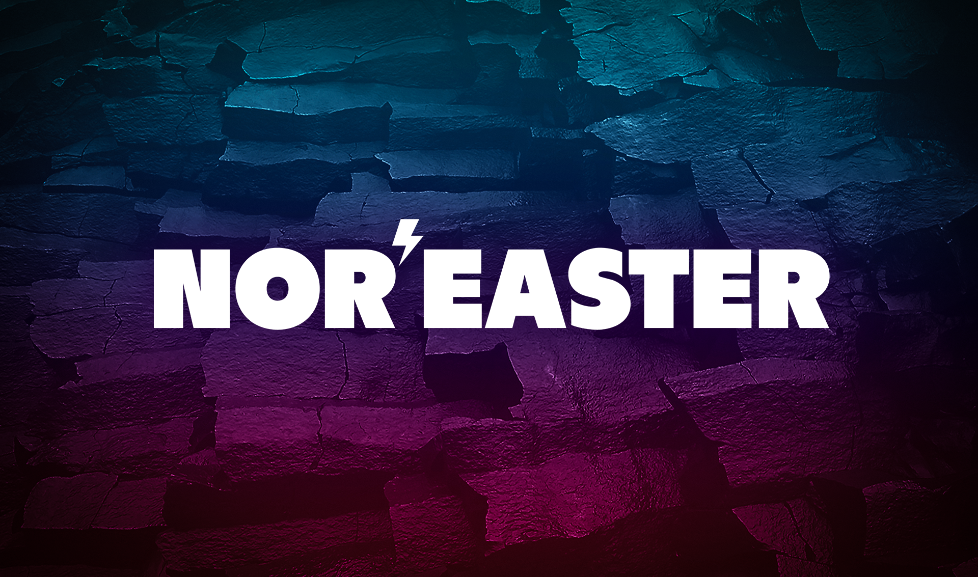
Second iteration of the Nor’easter logo. Getting closer, but still not quite right.
NOR’EASTER OF TODAY
In early 2024, my wife and I bought our first house on the Eastern Shore of Maryland. Having a home brought a real sense of permanence. It felt good to choose a town and say “this is where we’ll live, this is where we’ll work, this is where we’ll raise a family.” In a word, we felt very mature. Nor’easter had grown tremendously from those post-COVID days of 2021, and we wanted the brand to reflect the permanence that it was building too.
While not a total rebrand, the changes were probably some of the most impactful. Our friend and collaborator, Pierce Liefeld, worked his design magic and cleaned up the logo kerning and bolt placement. We simplified our color scheme to allow for high-contrast designs: bright whites and electric blues paired with black and deep navy backdrops. We even trademarked “Nor’easter Digital®” and the updated logo design. This was our way of saying Nor’easter is a permanent fixture too.
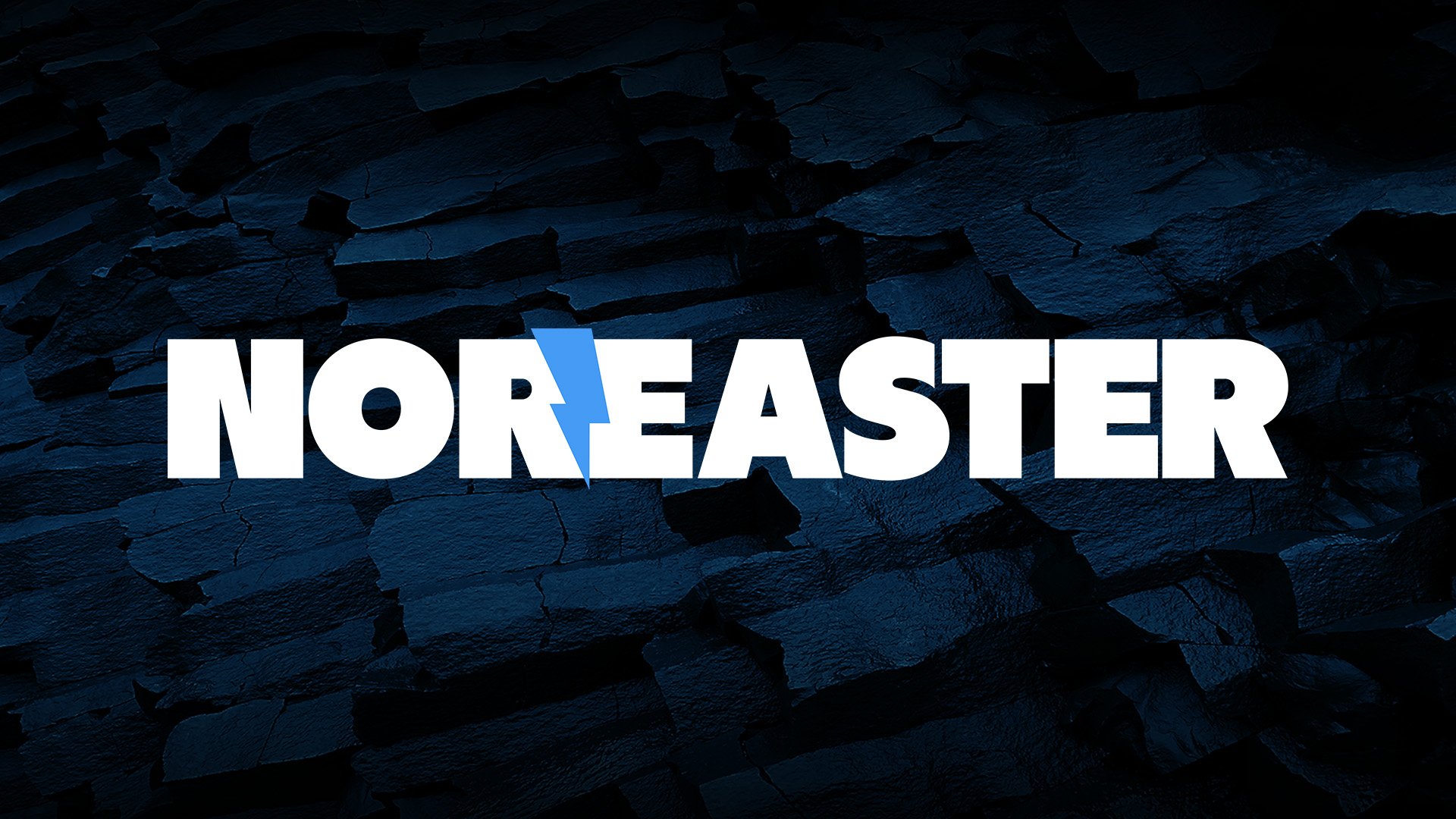
Our new and improved logo, established in 2024.
After years of iteration, I believe we’ve found the perfect visual identity for the Nor’easter team, and it’s one that we’ll be proud to bear for years to come.
